
The Asian Art Museum in San Francisco revealed a new logo recently as they re-brand the museum for the future. The new logo is this upside-down ‘A’ below which at first had me baffled, but as they describe….

Why did you change your logo?
The museum is reinventing itself to engage a broader audience. While the logo is a visible part of our new brand, the real change is in how we’re rethinking the experiences we deliver. Our focus has shifted from presenting stunning artworks to delivering captivating art experiences centered around stunning artworks.
…
Why is your logo an upside-down A?You recognize the symbol, but you’re looking at it in a new way. This is what our curators do in creating art experiences. Our logo catches attention, clearly communicates a new perspective, and is a welcome sign to all. We LOVE that an upside-down A is the mathematical symbol signifying “for all.” Our Asian art experience is for everyone. For all. At the end of the day, it’s all about standing out, and triggering interest, discussion and visits.
…which makes sense. The design does stand out and smartly designed it to be modified with colors and patterns which make it customizable inside a simple bold graphic that will age gracefully and last for a very long time. It’s nice to see a graphic that is functional in such a strong way.
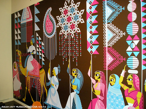
But the Museum also took another bold step to attract new/young audiences who sometimes avoid things that don’t look fun with special branding of their new exhibit ‘Maharaja’ featuring the illustration work of Sanjay Patel (gheehappy.com) who has published books with his clean digital art of Indian themes as well as worked at PIXAR animation studios. The move was bold and exciting to not show the actual historical pieces in advertising, but modern illustration art that is very graphic in nature and could reach out to new audiences.

For me the changes have worked and I think this represents the way of the future as art presentation shifts to being “captivating art experiences”,but that also means that the lines to what is art is also changing too with merchandising, multimedia and theatrical flair thrown into the mix.
Interesting and exciting time are ahead.
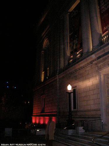
(above) Outside the building is list with pink lights that match the color on Sanjays illustrations like the one below…
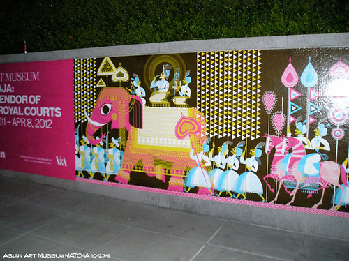
(above) The illustrations look to be drawn in a vector based program like Adobe Illustrator and feel very much like they are inspired by the work of artists from the 50’s and 6o’s like the Mary Blair who designed the look of ‘It’s a Small World‘ and ‘Saludos Amigos / Three Caballeros‘ for Disney.
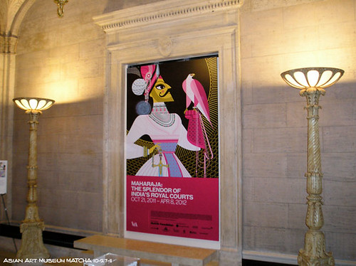
(above) The color pallet is browns and pinks and blues and golds. Unusual mixes of colors that work great.
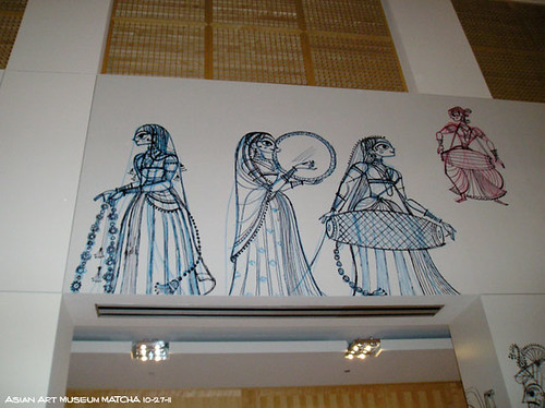
(above/below) Tight pencil drawings are blown up as decals on the walls for a stunning effect. To find out more about planning the use of the designs, check out this post on the official blog.
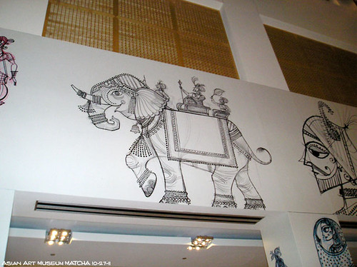
(above) Love the elephant.
(above) One of the murals inside the museum.
Click here to find more Books by Sanjay Patel on Amazon or click the book cover images in the article.


